A lot of people think of Rajasthan as a desert. But, that’s not completely true 😉 Udaipur is known for the Aravalli ranges, lakes, and the palaces. We wanted to keep the same in mind while designing the logo and banner image.
So, we started looking around for inspiration. Udaipur’s City Palace is known for its beautiful architecture and that was the first place where we wanted to go hunting for inspiration.
The Design
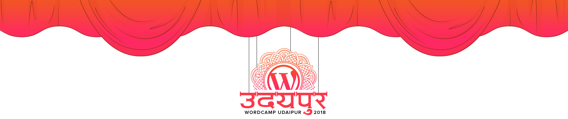
Since the 2017 logo was so impressive, we decided to redo it and bring it back to life. We pivoted from mono color to gradient style and here was the result.
![]()
What Inspired us for this design?
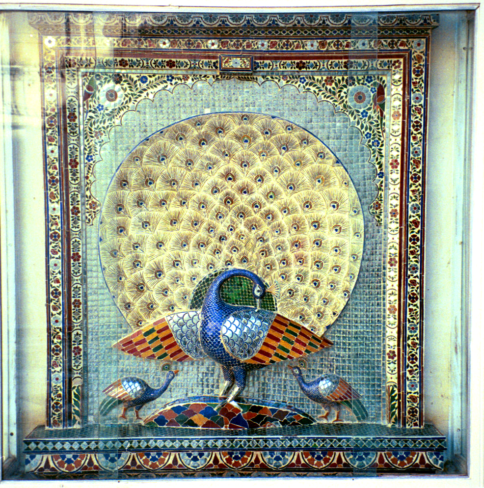
The “Mor Chowk” in City Palace has beautiful designs of Peacocks in various positions. It’s incredibly beautiful and we decided to take that up as a major part of our logo.
Here’s an image from the Mor Chowk.
Colors
Mandaana (Line art) is a common art in Udaipur and Rajasthan. It’s used for wall paintings and also for painting “Rangoli” on the floor to welcome guests. It uses home-made colors of orange, brown, red and white. We decided to use the same in our logo as well.
So, now, we were done with our inspiration and ideas for the design and color scheme. We started working on this and Ramesh (Graphic designer at IdeaBox Creations) came up with multiple great concepts.
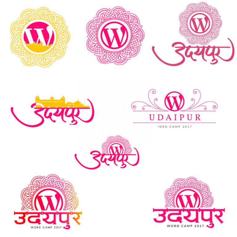
The floral design resembles the Peacock art in the Mor Chow (as shown in the image above). We used vibrant colors to depict colorful Rajasthan.
Next, came the idea for designing the header image and once again, Ramesh was creative enough to come up with many great ideas!
Final Logo & Header Image
Finally, after a long and tiresome process of choosing, we had a winner!
![]()
Peach / Orange color – for the traditional art.
Floral Design – Inspired from the Mor Chowk at City Palace, Udaipur.
It always feels good to see the end result of the efforts that we have put. Entire WordCamp Udaipur team is really proud of this creation.